对话框 Modal
1.说明
模态对话框。
何时使用
需要用户处理事务,又不希望跳转页面或打开滑动面板以致打断工作流程时,可以使用Modal在当前页面中打开一个浮层,承载相应的操作。
2.API
| 属性名称 | 数据类型 | 是否必填 | 默认值 | 回传参数 | 说明 |
|---|---|---|---|---|---|
| width | number | 否 | 730 | 空 | 宽度 |
| height | number | 否 | 650 | 空 | 高度 |
| resize | bool | 否 | false | 空 | 可改变大小 |
| showOK | bool | 否 | false | 空 | 显示确定按钮 |
| showCancel | bool | 否 | false | 空 | 显示取消按钮 |
| autoClose | bool | 否 | true | 空 | 点击确定按钮后,是否自动关闭对话框 |
| OKHandler | func | 否 | null | 空 | 确定事件 |
| className | string | 否 | "" | 空 | class名 |
| tipShow | bool | 否 | false | 空 | 是否显示提示信息 |
| tipContent | any | 否 | "" | 空 | 对话框友情提示信息 |
| cancelHandler | func | 否 | null | 空 | 取消事件 |
| footerContent | any | 否 | null | 空 | 对话框底部的内容(放左侧) |
只读属性
| 方法名 | 参数名 | 参数说明 | 返回值类型 | 说明 |
|---|---|---|---|---|
| open | 空 | 空 | 空 | 打开 |
| close | 空 | 空 | 空 | 关闭 |
3.代码演示
/**
* Created by ZhiRongYuan on 17/6/5.
*/
let React =require( "react");
let ReactDOM=require("react-dom");
let wasabi=require("wasabiD");
let DataGrid=wasabi.DataGrid;
let Button=wasabi.Button;
let Modal=wasabi.Modal;
let Transfer=wasabi.Transfer;
var alogUtil = require("../libs/alogUtil.js");
class Demo extends React.Component {
constructor(props) {
super(props);
this.openModal = this.openModal.bind(this);
}
openModal(){
this.refs.modal.open();
}
render(){
return (
<div>
<Button name="open" title="打开对话框" onClick={this.openModal}/>
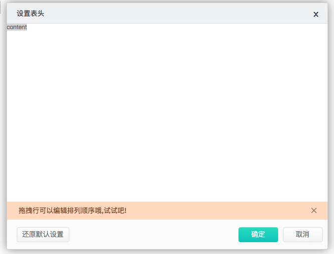
<Modal ref="modal"
className="wasabiSetHeaderModal"
tipShow={true}
tipContent="拖拽行可以编辑排列顺序哦,试试吧!"
title="设置表头" height={500} width={650} resize={false}
showOK={true} showCancel={true} OKHandler={this.setModalOKHandler}
footerContent={<Button title="还原默认设置" key="reset" theme="cancel" onClick={this.resetHandler}
style={{ height: 30}}></Button>}
>
<div>
content
</div>
</Modal>
</div>
)
}
}
ReactDOM.render(<Demo/>,document.getElementById("root"));